DABBIN’ DANKS
BRANDING & PACKAGING | ART DIRECTION & DESIGN
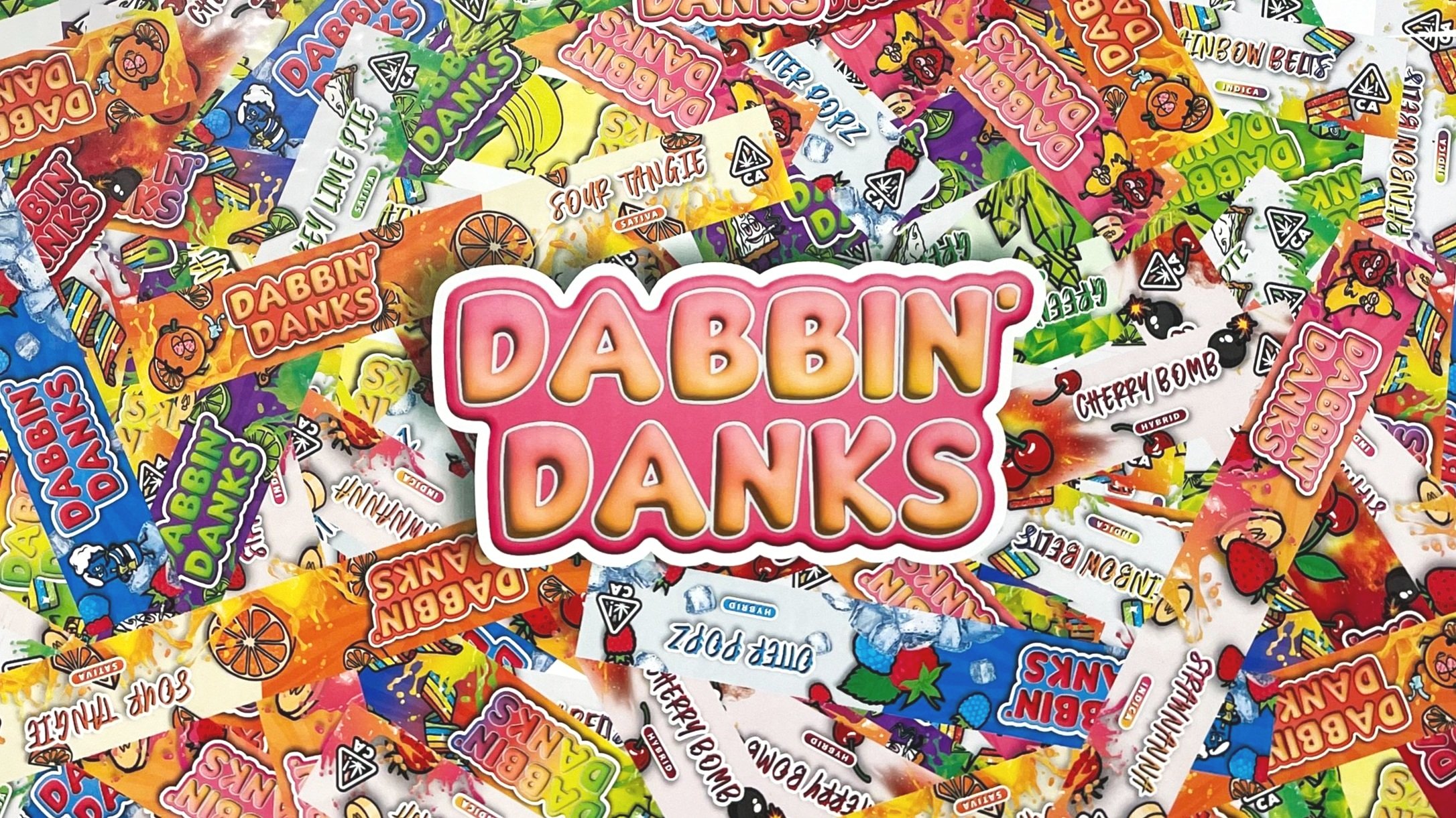
DABBIN’ DANKSs is an extract line under the Upper Echelon brand umbrella. This brand is playful with bold color and whimsical characters. The packaging takes influences from the graffiti sticker culture of vintage skate and surf brands .
PACKAGING
The brand revolves around 8 characters. Each represents a different flavor of extract. The jar labels are printed with a matte lamination and spot uv. The custom boxes are UV printed on gloss substrate. This allowed us to play with gloss effect of the paper and get some really unique packaging.
CREDITS
Art Director: Michel Montmorency
Designer: Cameron Garcia
Agency: POPHEAVY


